Overview
Curator: Darrell Glover
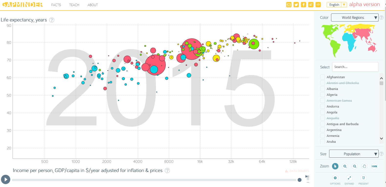
Brief Description of Resource: The Gapminder World graph allows the user to display a wide variety of data in univariate or bivariate formats grouped by country and year. The user is able to choose which data is represented on the x and y axes and the manner in which the data is displayed (bubble chart, mountain chart, line, bar, etc.). The tool then automatically compiles and displays a graph of the requested information. As such, it provides a massive repository of data that can be used for many different data analysis exploration activities, problems, and/or projects.
Technical & Cost considerations: This tool is free from Gapminder.org, the online representation of a foundation seeking to provide reliable statistics for various uses. It will work on any computer with an internet connection but, as the data requested is sometimes extensive (can be a over a hundred years worth in many cases) the graphs can sometimes take a minute to load. The graphs are large with many bright colors making them easy to read and display in a classroom.
Evaluation
Description of Learning Activity
This tool would be excellent for an introduction to bivariate data analysis and scatterplots. The teacher could pull up an example graph and provide a few guiding questions for small groups of students to discuss. Examples could include, what the size of the bubble corresponds to, what the axes mean, what does a point's position on the graph indicate, and are there any general correlations that can be drawn from the data. The teacher can then pull the classroom together for discussion of the questions and provide more details on the topics of bivariate data and scatterplots and then let the students explore other types of representations for the given graph or representations of other data points.
1. Learning Activity Types
- LA-Present - Teachers are able to present various types of representations of data for analysis
- LA-Present-Explain - teachers/users are able to explain mathematical correlations using different sets of data
- LA-Explore - the user is able to explore different ways to represent univariate and bivariate data
- LA-Apply - the user is able to apply data analysis principles to various representations
2. What mathematics is being learned?
Standards
NCTM:
- Understand the meaning of measurement data and categorical data, of univariate and bivariate data, and of the term variable
- Understand histograms, parallel box plots, and scatterplots, and use them to display data
- For bivariate measurement data, be able to display a scatterplot, describe its shape, ...
- Display and discuss bivariate data where at least one variable is categorical
- Identify trends in bivariate data and find functions that model the data or transform the data so that they can be modeled
Common Core (non-specific):
- Summarize, represent, and interpret data on a single count or measurement variable
- Summarize, represent, and interpret data on two categorical and quantitative variables
- Interpret linear models
Proficiency Strands
- conceptual understanding - this tool allows the user to represent data in various ways in order to find useful relationships depending on the user's purpose
- adaptive reasoning - this tool allows the user to make logical connections between various data points
- productive disposition - this tool is an excellent way to show mathematical connections to the real world
3. How is the mathematics represented?
The two main ways that the tool utilizes to represent concepts is graphically and symbolically. Most of the data representations are done in a graphical format where the user can choose which date points make up the x and y axes. There are also some symbolic representations of univariate data points available and the bubble charts utilize both types with the size of the bubble symbolizing an additional data point. One of the most interesting representations available with this tool is the ability to track a selected country across a number of years. The charts come with an option to play the data, that is, watch the data points dynamically plot throughout the years, forming a picture into how the selected data points have evolved over time. This option allows for fast and easy comparison between different countries or different years.
4. What role does technology play?
The biggest advantage this tool provides is the sheer amount of information that is available. Because of this, it is quite likely that the user will find data that they can connect with. However, that amount of data can also be the biggest disadvantage as well since the user can easily become distracted or get lost in the data; this tool would work best with some guidance questions for the initial activities before letting students explore it on their own. Another advantage is the various ways that the user can represent the data. By affording different representations, different factors can be analyzed more easily allowing new connections to be made.
Affordances of Technology for Supporting Learning
- Computing & Automating - the user is able to draw on and display massive amounts of data almost instantaneously
- Representing Ideas & Thinking - the user is able to display the requested data in numerous ways allowing analysis of various factors
- Accessing Information - there are an exceptionally large amount of information types available
5. How does the technology fit or interact with the social context of learning?
This tool can be used by individuals, small groups, and for classroom presentations. The amount of data that can be called upon makes the tool quite useful for small group activities where a lot of discussion can take place. Large, classroom discussions might be slightly more difficult (because of the various tangents that can be hit on) unless there is a strict focus to the stated questions.
6. Additional Comments
I thought the play function on the graphs was a great feature. It clearly shows how a country's statistic has changed over time providing interesting views on outlier points that can be associated with important world events as well as allowing valuable comparisons amongst countries and regions of the world. I feel like I only scratched the surface of what this tool is capable of and look forward to exploring it further.
